Monday, October 10, 2011

Plein Air Follow-through—More or Less


Well, after all my posturing about getting out of the studio and painting en plein air, I made myself do it! I mean, what could be better than a 70° autumn day in New Hampshire?
I started with a pencil sketch and quickly got bored and my back started aching. Once I sketched out the basic lines, I switched to an indelible black ink marker and wondered why I was even bothering.
The Perfectionist sitting on my shoulder, whispered, “You call yourself an artist? Is that what you call perspective? You haven’t laid down one plum line! And that, after resorting to an eraser!”
“What—you think I can’t see that?” I kept at it, telling myself that I really hate sketching. I was about to abandon my aspiration and simply call it an attempt. Then my Motivational Critic jumped in.
“What! You’re not even going to follow through and break out the paint—Oh, how pathetic are you!”
So, I cracked open my paint. After about 60 seconds, I got bored again and just wanted it to be over with, so started laying down paint more quickly (it dawned on me that this was likely what I should have been doing in the first place).
I shrugged the Perfectionist off my shoulder and heard my MC whisper, “At least you can say you tried and followed through—good for you!”
“But I don’t have to do this again, do I?”
“Well, did you have fun?”
“Not really.”
“Then why do it?”
“I don’t know— It’s such a romantic notion…I just really wanted to be the artist who could whip out my paints anywhere and produce something really stellar.”
“Why?”
“I feel as if I’m stagnating in the studio.”
“Really? But you produce some pretty remarkable stuff in there. You like it—I’ve seen how you study it afterward with satisfaction. Why can’t you be happy with that?”
“I’m not sure…”
“Well, you need to figure that out.”
“Yeah, I know…maybe I’ll carry my paints and tablet around just in case…”
Sigh. “Whatever…” 


Thursday, June 23, 2011

Pushing My Envelope—En Plein Air


I haven’t painted anything in so long that I think I may have forgotten how! However, that doesn’t mean I haven’t been thinking about it. In fact, I’ve been doing better than just thinking—I’ve been planning…

Here’s the thing—As you know, I work almost exclusively in my studio, from photographs. It’s a safe and comfortable place, and I’ve done some of my best work in my cloistered environment. The problem is, I feel as if I’m beginning to stagnate. I’ve been following Bruce Sherman’s blog, Journaling With Paint, for some time. Get this—he actually goes outside and paints! That’s right—Plein Air Painting! In fact, artists have been doing it for centuries! Believe it or not, I also have done it—years ago.
 
Look! I even made a field kit! (Okay, notice the EKC latch that I ripped off an old camera case—I do so love old latches.) 
I even covered it in a nice soft leather and purchased a Windsor Newton field kit to go inside. I did use it on several occasions, but found that my discomforts outweighed the pleasure.

The problem is, I am overcome with self-consciousness if I think anyone might come along and look over my shoulder. I’m certain it has a lot to do with Dumbbell Syndrome.

Anyway, the point of this post is along the same vein of why I started this blog in the first place. I won’t use the derogatory term ‘guilt me into it’ but I know that if I post this, I am far more likely to follow through. As an incentive, I am also posting these samples of what I accomplished—or tried to—back in the mid ‘90’s.

I really muddied up the shodow on this one...

Some big old house in New Harbor or Pemaquid Maine

I like architecture

Not sure why I didn't finish this cemetary 

This one I'm actually proud of. There had been a lot of tourist traffic, but I stuck it out. Eventually, I ran out of light, but fortunately, I snapped a photo of it before I left so I could finish it up at home.  

To ease myself into it, I think I'll start with something from my own back yard... 


Friday, March 18, 2011

Distracted

I just can't seem to get my head into painting these past couple weeks. I don't know, maybe it has something to do with the fact that we are just about to put our house on the market--I mean for real--like we need to be ready to up an move, cross country, really soon...Then again, it could take months and months, but the last time we listed a house in a down market, we had a buyer in a matter of days, and then life took on a rythm of another pace altogether.

So, anyone know of anyone who wants to buy a gentleman's farm and an arsty house?

Sunday, February 27, 2011

Eggs, Linen & Glass: Finished At Last!

Yes, it's true, I'm finally calling it done--not sure that I can't improve upon it, but at this point, I don't care. I simply can't look at it a moment longer. I think the lace was probably more of a challenge than the glass--lace has fewer hard edges and requires more blending. I could have done more, but Todd was constantly over my shoulder saying "Don't overwork it!" As if!


Okay, I did overwork it a tad, but I'm pleased with the results. It is 8" x 10" and I now need a stronger pair of readers...

...so...I've got an idea for my next project...something highly reflective, small and sentimental...but I have to wait for some bright sunlight before I can start it, and in Michigan, well, that could take a while...

Thursday, February 24, 2011

Eggs, Linen & Glass: Not Quite Done...

I know I said I wasn't going to post again until I finished, but all the finer details in the cloth and lace--let alone the glass--is taking longer than I wanted it to. Therefore, I'm posting this just to show that I am progressing...

I also noticed that I needed to darken the tone in places, so, overall it looks a bit darker. Then once I'm happy with the tone, I can add the white glaze where I want to brighten it...


...and then there are all those hardline edges I need to add for the finishing touches!

Saturday, February 12, 2011

Eggs, Linen & Glass: Step 7

I feel the need to post something... Again, it may not look like much, but I workded on the lace, which is as painstaking as the cut glass. Just so it's not the same ol'-same ol', here's the photo, too. I won't post again till it's done. Hopefully that won't take too long...


Sunday, February 6, 2011

Eggs, Linen & Glass: Step 6

Okay, I'm just posting this so I can see that I have progressed...besides, I never pomised this would be exciting...

Friday, February 4, 2011

Eggs, Linen & Glass: Step 5

I started out slow today, but once I got going on the eggs again, I found it oddly soothing. I must remember that for when I start feeling anxious; Paint Eggs.


Speaking of painting eggs—I can't remember if these where white eggs or brown, but I'm thinking white. This made for an interesting observation this late afternoon when the sinking sun crept in the window behind me, illuminating the photo from which I'm working. It highlighted and exaggerated the different hues of the eggshell. Ultramarine, crimson, ochre—colors you would never expect, right? (Okay, I did have a hunch they were hiding there). When the sun disappeared, the colors again subdued, but I like the color in the eggs so much better. Perhaps I’m getting creative with my painting and not so rigid…

I'll bet you wish you knew what the photograph looked like!

Thursday, February 3, 2011

Eggs, Glass & Linen: Progress

Not much progress, but I want to provide proof that I have been working on it--and more than just that lace loopy thing on the side...

Monday, January 31, 2011

Eggs, Linen & Glass: Step 3

Even though I've done a painting similar to this one, it was so long ago that I don't remember exactly how I approached all those facets of glass. This one is a little larger, and good thing!My eyes are that much worse these days (go figure). As I go along, I'm finding that the best approach is not to focus on one area for too long, and keep reminding myself that it always takes shape in time.

Saturday, January 29, 2011

Eggs, Linen & Glass: The Wash

Well, most of it is 'washed', however I couldn't really 'wash' the cut glass. All those facets--well, each one is its own peculiar shade of gray and umber. At least you can gather the color scheme.


This will be more of a study in texture rather than color, and an exploration of backlight and reflection. It will be tricky going--I may even need to don the magnifying goggles, but I shall prevail!

Friday, January 28, 2011

Finally, A New Project

...yes, it's true, I'm undertaking another watercolor, but this is no ordinary painting; it may quite likely be the painting that drives me to the brink of insanity! (Yes I know that's not a far drive from where I'm at.)

I know it's probably hard to tell what it will look like from all those teensey-weensey lines, but if you've been to my Website, it may look familiar. It is, in fact, a variation on a theme I worked up several years ago, and I can tell you that it tested my wits even then (back when I had a few more wits about me). I posted something about that a long while ago, and even now I can't believe I'm considering this project (okay, I'm more than considering it, 'cause I've done the drawing and posted it).

I can't gaurantee that this will be a happy ride for observers, but I'm going to try hard not to whine about it. I can't promise I will finish it in a timely manner, but I may post more stages, just to provide evidence that I'm still working on it...

The finished painting will be 8 x 10 inches, and in case you're wondering, it is titled Eggs, Linen & Glass.

Thursday, January 27, 2011

Troubled Mints

I know I'm not the only one who has a hard time in winter. Every day feels like a struggle. But sometimes, just one silly little thing can put a smile on my face.

I've been enjoying Altoids Curiously Strong Peppermints since back in the early '80's when it seemed the only place you could get them was through the Vermont Country Store catalog (I think they were curiously stronger back then, but that could be my imagination).

Yesterday, when I opened a new tin, this is what I found...

Just knowing there is a home for Troubled Mints* puts my mind at ease...perhaps then, there is also a place for me...

* I think Altoids may acutally be having a little fun with the 'troubled' Royal Mint... 

Tuesday, January 4, 2011

New Header Design for My Writing Blog

Okay, so I thought it would take me a few days, but I went ahead and got busy on it…
This is what I’ve come up with as the new header for my writing blog.


Now to apply it and change the background and fonts and colors too (to the blog itself—not the header)—could take another day…maybe not that long….

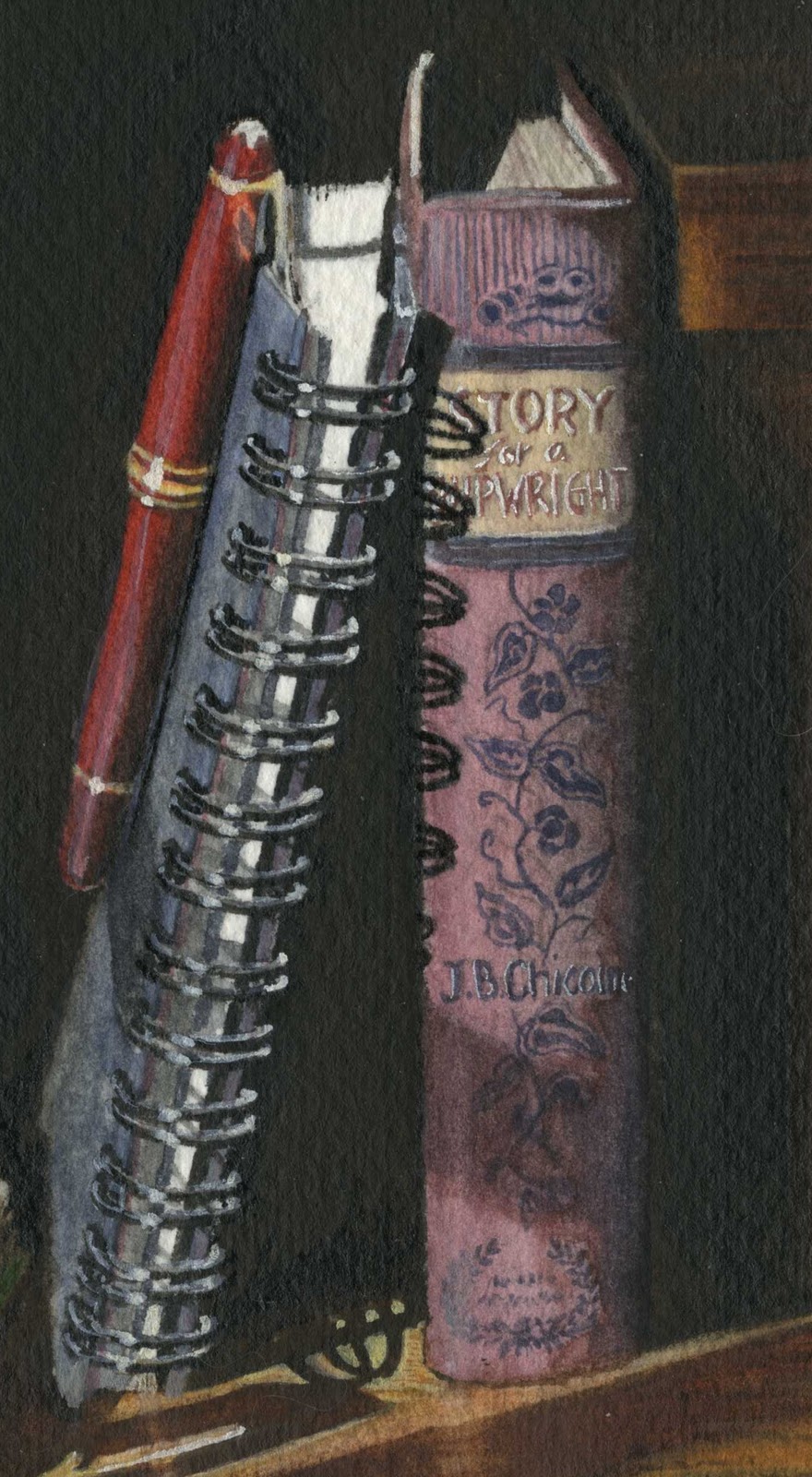
...and of course, I couldn't resist putting my Story for a Shipwright for the book title...

Monday, January 3, 2011

Reading & Writing: Finished—Finally!

I almost thought I was going to have to put this on the Projects Waiting page. I guess I just wasn’t in the mood to paint while I was away (I did however get a lot of writing done). When I finally put brush to paper, it didn’t take that long to finish. I know it’s not as dark as the photograph I posted, but it is close to the tone of the one I printed. I kinda wish I had stuck to the darker, but if I don’t compare the two, I like this one just fine. (Comparisons really are evil).


…Now, to design a header from it…

Thursday, November 4, 2010

Reading & Writing: Progress


I’ve been trying to pick away at this a little everyday for the past week or so, some days with more success than others. I’ve been insanely busy, getting ready for a big trip out east* and this has plummeted to a low priority.


The open page looks a bit muckier than the actual painting—not that you noticed... And, in posting it, I can see that I made more progress than I thought (which is another good reason to post these sequences!) At any rate, just so you won’t think I’ve dropped off the deep end, here’s a little update and a happy picture of where I’ll be spending the next little while!

I think I’ll take my paints with me—maybe I’ll have it finished for when I get back…


 * to the land of limited internet access and semi-self-imposed break from blogging.

Monday, October 25, 2010

Wednesday, October 20, 2010

Reading & Writing: The Wash—Sort Of

Technically, this isn’t exactly a wash on account of the black India ink. After my recent ink mishap, I was a little nervous, but decided that I should lay the ink early on--that way, if I ruined it, I could easily start over without having invested a lot of time.

I'm happy to say, all went well…

Tuesday, October 19, 2010

Reading & Writing: The Drawing

Not too much to look at here...

I do have to decide if I want to cheat a little and use black India ink for most of that dark background, then give it a quick lamp black wash to blend it with the rest of the elements...

Technically, if I were a traditional watercolorist, that would be right out of the question. And once it was done, I would have to call it 'mixed media', not watercolor--technically.

However, we know I am not a traditionalist... 

What to do...what to do...

Monday, October 18, 2010

Reading & Writing...and the Photograph

#1 is my pick.
It has all my favorite elements, minus a gleaming pen nib, but really, that's such a small thing. I'd say the two biggest determining factors were the back-lit page and the coil shadow...and then there's all those great squiggly shadows on the open page...and...upon closer scrutiny, you can actually see the window pane and treeline in the reflection on the spectacle lens! (not that I'll try to paint that—oh, no, not me). 

Although #2 seems popular, the open page has more to offer in the way of breaking the black. The negative space plays as much into the composition as the other elements and I do so love the dramatic effect. The black also leaves much potential for expanding the perimeter to the left, and fading into dark for an effective header. I've already messed around with some lettering and I'm pretty sure I'll be happy with it.


Even as a piece of wall art, I think it holds it own, at least that's what Todd says. He thinks it implies tall ceilings and wide open spaces. The question it brings to my mind is, What—out in the black—called the reader away?

Saturday, October 16, 2010

The Starting Line

Yesterday afternoon, I sat looking at my writing blog—specifically, at its header. It is probably one of the most boring headers I have ever seen. And for someone who claims to be an artist? Well, it’s just a little embarrassing...

I thought, Wouldn’t it be nice if I had a very writerly or readerly bit of my own artwork that I could incorporate into a header…hmmmm...in fact, I have been tossing around the idea of doing something bookish for a while, but wanted dramatic lighting, and simply hadn't found any such light in my environment.

At that very moment I felt penetrating warmth on the back of my neck and an annoying glare caught the corner of my monitor. When I turned to the source, why, the sun, traveling its new autumn route, was doing something wonderful and I knew it wouldn’t last long. I tore downstairs, already planning the layout, and gathered up a few props.

So, I thought it would be fun to show you the process—this time from the idea’s inception, through the selection method, and then into the usual stages of painting. I have a specific objective here—to incorporate the completed work into a header for my writing blog—so that will influence which layout I choose, but I also want it to be aesthetically appealing as wall art.

Here are the results of about a half-hour of late afternoon sun, a camera and tripod, and a spark of inspiration. Out of nearly 4o shots, I chose 6 candidates. They are all subject to future cropping for the optimal composition.
1) I really like a few things about this one: the way the underside of the open page is lit; the glare on the glasses; the way the light catches the ear-wire thingys, and the coil shadow on the standing book. I also like the sliver of light that passes through the spectacle lens and hits just below the coil. Then there is that little bit of light that catches the two corner parts of the wood post. I'm glad I thought to clip the pen to the tablet, though I wish the nib were showing. I also really like the way the red shows up against black.

2)...again, the contrast of the wire against black, the coil shadow, but I also really like the way the sun hits the  nib, and how the other end of the pen is mostly in the shadow, but the clip is lit.

3) ...yes, the transparency of the paper, the highlighted wire...and the way the letters on the book end look distinctly embossed up close, and, the same bit of light on the corners of the wood post.

4) ...the prominence of the glasses and the simpler, cleaner layout. Also, the extended, balancing shadow cast at the end of the tablet. There are also some nice and subtle reflections on the wood post.

5)...book page again, glasses glare, and the way the erect book is half shaded, and I love all the squiggly shadows on the open page. It's also a simpler, less cluttered layout.

6) This is clean and basic. It covers both reading and writing. The red and green make a nice contrast. And I really like the scrolling print on the book binding, and the great shadow cast inside the coiling.

Any thoughts on which you like best?
Shall I allow my vanity to replace these obscure book titles with my own?
(And for those of you who really pay close attention to detail, Yes, the green book is the very same that my redhead is reading in Cool Grass and one you may not have seen, Summer Read.)

Next, I will post the photo I'll work from...

Thursday, October 14, 2010

Toy Boat: Black & White


 I think the gray-scale turned out pretty good.
I think it makes as good a black and white photo as the real deal.
I think I like it even more than the real deal!
Maybe it's just the fancy shadow I applied... 


Wednesday, October 13, 2010

Toy Boat: Complete

Toy Boat is finished, complete with a string to keep a stiff breeze from taking it to the middle of the lake.
It’s always a little tricky getting the colors to scan and post just right—doesn’t really matter I suppose, every monitor’s color calibration is a little different. Just the same, it's worth mentioning that the hues in this version are much closer to my actual painting.

Perhaps tomorrow I will convert it to gray scale and see how it looks as a ‘black and white’ photo…

...So, can you see any difference between the previous stage and this one? If it didn't have the string attached, would it still look like a 'toy' boat?

Monday, October 11, 2010

Toy Boat: Nearly Done

I’m posting this one as the last step before I add white and my final hard-line edges—it's a good way to mark the contrast between this step and its completion. Also, it distances the finished painting from the photo, so it’s harder for you to scrutinize how closely I stuck to the original piece—yes, very tricky of me, I know. In fact, I have deviated from the color scheme just a little—I want the water to look more like fresh lake water rather than murky, city river water (no offense, Paris!).

Friday, October 8, 2010

Toy Boat and Photo

Well, this isn’t huge progress, but at least here is the photo from which I’m working.  I did a Google Image search for “toy boat” and found it on Steph and Mike McDowell’s Blog. Of course, I asked permission to use their photo—Toy Boat at Jardin de Luxembourg—and Mike so graciously allowed it. Thanks again, Mike!


 ...and the color of mine here looks more ultramarine than my actual painting--it's actually much closer to the color scheme of the photo...


Wednesday, October 6, 2010

Toy Boat Progress

Painting reflections on water reminds me of paint-by-numbers.

If I were to try and duplicate the exact pattern of reflections, I’d really go nuts—it’s much that way with painting grass also. I like to be detailed, but I simply repeat a pattern more than copy it precisely.

I think in my next post, I’ll include the photo I’m working from…

Monday, October 4, 2010

Toy Boat: Next Step

I’m never certain just how much I should paint before posting—it’s hard to gauge progress as I’m working on it. So, I scan it, compare it to the last post, and if it looks considerably different, it ends up here…

Perhaps today I will give the boat itself a little more detail and put in some additional green reflections.


Saturday, October 2, 2010

Toy Boat: Wash


There’s not a whole lot to the wash in this one—just varying shades of blue and greenish-blue, with a bit of varnished mahogany. The background will be the labor-intensive part.


…ooops, I missed the tiny hatch on the deck, oh well, I’ll fill it in later…

Friday, October 1, 2010

Toy Boat Started


Here’s the first stage—the drawing of Toy Boat (yet another imaginative name). It has a simple color scheme, and lots of opportunity for repetitive motifs, but not like grass (yes, I'm tired of grass). I feel fairly confident painting reflective water, since I’ve done it here, here, and I particularly like it here. The trick is to convey the boat's ‘Toyness’—hopefully, the scale of it compared to the ripples of the water will help…

Thursday, September 30, 2010

Next Project!

Okay, I’m posting this just so you all won’t think I’m plummeting into the depths of despair over my last project. I’m actually taking the mishap a whole lot better than I would have expected, which is wonderful progress at keeping perfectionism from defeating me. But mostly, I just want to say that I found a new project.

You may have noticed on my writing blog that I’ve somehow managed to secure a place in the Notes From Underground anthology, over at The Literary Lab. If I don’t use up all my 10 pages with words, I can include a bit of artwork. It would have to be black and white, but a watercolor painting will be easy enough to convert to an 8-bit gray scale. Actually, black and white will work well, since I want it to resemble a black and white photo—which means I will be shooting for ultra-realism. Why not use a black and white photo, you ask? Well, first, I don’t have one I can put my name to, and I have found the perfect photo to work from. Yes, it’s sort of a backward way to go about it, and well…I have no defense there…except I think it's supposed to be my work in the anthology.

I will post the photo and credits once I have progressed a bit…

...it also occurs to me that since this will eventually be converted to B&W, it should teach me something about the reverse process, which I would really like to master...

Wednesday, September 29, 2010

Haying Abandoned

I hadn’t intended to introduce a UFO into this project, but my indelible black ink pen exploded. And just when I was beginning to think it might turn out okay...I suppose it does give the boy something to look at...


Oh well—off to the abandoned projects file with it…

Tuesday, September 28, 2010

Haying: Progress—Sort Of

Well, this is a woeful pace I’m working at—but it’s all I got. Todd’s been hovering over my shoulder saying, “Now, remember about overworking it—what have you learned from past experiences?” To which I reply, “ta not ta” (but I don’t really mean it).

It turns out my brown ‘waterproof’ ink is not so waterproof—(I think a waterproof ink should have a longer-than-twenty-year shelf life before it starts breaking down). Well, at least hay looks brownish at harvest time. At this point, it’s hard for me to take this piece seriously, so at least I’m not all in a bunch over it anymore. I’m just posting this so you won’t think I hacked it to bits or lined the proverbial hamster cage with it. I think I’ll just call it what it is—experimental—and play with some more color and then call it done. To be honest, I’m itching to start something more along the lines of my usual—just have to find the right subject…

…and I don’t know what happened over there on the right-hand horizon—okay, well, I do know what happened but I don’t feel like elaborating…
 
...and I sort of fixed the problem grass under the guys arm—not that anyone but me notices...