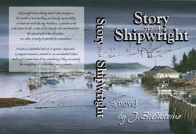
 Although I like the cover as it was, I thought there ought to be something I could do to make it a little more 'shipwrightish.' The woodcut version I originally designed accomplished that, but it looks too bland to me now. (However, I do think it would make a nice title page.)
 So, this is what I came up with as a front cover:
Do the ‘boat plans’ look too cluttery, or does it add that little something extra that gives a better sense of the story being about a shipwright?
Which do you like better?


I like this cover (ie the watercolor), but I wonder if a picture like the one on the right side might work, too--perhaps with both Samuel and Marlena sailing, to give a focus to the cover and draw the reader in more.
ReplyDeleteMary Jo, I've thought of doing a cover with both Sam & Marlena in it--perhaps a watercolor version of the woodcut, but I'd have to rely wholey upon my imagination, something at which I am completely unskilled. All I come up with are lame pencil sketches...
ReplyDeleteI like the one without the plans. It feels to busy to me, otherwise. There's so much going in that beautiful painting. :)
ReplyDeleteYep, that was my concern, too, Michelle. Thanks for weighing in.
ReplyDeleteI agree. Although I like the idea of the plans, I think it works better with just the picture.
ReplyDeleteMy concern is the font for your name. The cursive works fine for the words, "for a" but I think your name should be in the same clear font as "Story". Possibly it should be on the right side, since on the lower left, the dark mass of the fence is there to balance the lettering.
Also, do you need to have "by"? I think it would look cleaner with just your name and "a novel".
Thanks so much for your observations, Tara. It's amazing what a fresh pair of eyes will pick up :)
ReplyDelete