Showing posts with label Reading and Writing. Show all posts

Friday, May 18, 2012

A New J.B.Chicoine Header Underway

I had every intention of posting my progress incrementally, but—well…I simply wasn’t feeling real enthused about this project. Aside from my ultimate goal—designing a new homepage for JBChicoine.com—the need for which is pretty darn exciting (adding Novelist to Artist), the process causes me great anxiety. I guess that’s what sucked some of the enthusiasm out of painting. Aside from that, when I set my Reading & Writing watercolor beside it for reference, the favored painting taunted me. How could I produce anything that would not wither beside it? And this new painting is supposed to represent my art side of the Website! Okay, yeah, I allowed my negativity (and funner* graphics projects—more on that another time) to get in the way and stall my progress.

Yesterday, I finally sat down and forced myself to finish it. Overall, I’m please with the result—it’s not as dramatic as its sibling, but how can ‘blank’ compete with all that dramatic black? (see previous post). Just the same, it has a nice light and airy feel to it.

Here is an idea I had for making the transition between the two images (it was my husband’s idea to chop off my bottom). I really like the concept of having an image of the painter/writer in the heading, except the face belongs to me. Ha! Having ‘me’ so prominent makes me squirm a bit, but objectively, I really like the composition—I like all the juxtaposed angles.
Now, I have to pick a day when I’m feeling really fresh and in control and patient, and dive back into the software program I used to design my Website in the first place, and relearn it. I am not looking forward to that. I need a new chant…  “I will not have a meltdown…” (that sounds too negative) “…I can do it!...I can do it!...”


* although MS Word says “funner” is not a word, Merriam-Webster’s Multi-Reference Dictionary says it is.

Wednesday, April 25, 2012

A New Painting for My Website Header

Well, I decided it's time to update my watercolor Website, J.B.Chicoine.com, to accommodate my upcoming novel. Uncharted won't be released until October, but it will probably take me that long to relearn my Web design software. In addition to that novel, I have others I plan to publish, so I may as well take advantage of having a Website with my name and combine my "artistic" endeavors.  Anyway, I'm going to incorporate the header I made for my writing blog (which I painted here a while back). 
I'll use the above painting for the Author half the page header... and start a new one for the Watercolorist half--something along the lines of the watercoloring arrangement to the right. But I like the oak and post setting of the Reading and Writing scene. So, below is the drawing I've come up with. I took a photo of a new arrangement, flipped it horizontally with my graphics program and messed with the perspective a little. I'll keep the background light and abut the two paintings, end-to-end; the dark contrasting with the light.
That's the plan, anyway. 

Tuesday, January 4, 2011

New Header Design for My Writing Blog

Okay, so I thought it would take me a few days, but I went ahead and got busy on it…
This is what I’ve come up with as the new header for my writing blog.


Now to apply it and change the background and fonts and colors too (to the blog itself—not the header)—could take another day…maybe not that long….

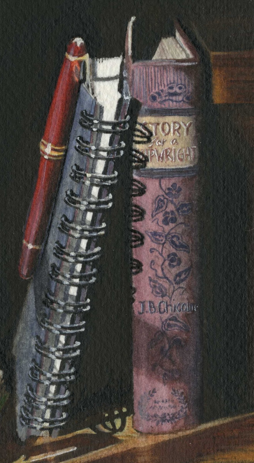
...and of course, I couldn't resist putting my Story for a Shipwright for the book title...

Monday, January 3, 2011

Reading & Writing: Finished—Finally!

I almost thought I was going to have to put this on the Projects Waiting page. I guess I just wasn’t in the mood to paint while I was away (I did however get a lot of writing done). When I finally put brush to paper, it didn’t take that long to finish. I know it’s not as dark as the photograph I posted, but it is close to the tone of the one I printed. I kinda wish I had stuck to the darker, but if I don’t compare the two, I like this one just fine. (Comparisons really are evil).


…Now, to design a header from it…

Thursday, November 4, 2010

Reading & Writing: Progress


I’ve been trying to pick away at this a little everyday for the past week or so, some days with more success than others. I’ve been insanely busy, getting ready for a big trip out east* and this has plummeted to a low priority.


The open page looks a bit muckier than the actual painting—not that you noticed... And, in posting it, I can see that I made more progress than I thought (which is another good reason to post these sequences!) At any rate, just so you won’t think I’ve dropped off the deep end, here’s a little update and a happy picture of where I’ll be spending the next little while!

I think I’ll take my paints with me—maybe I’ll have it finished for when I get back…


 * to the land of limited internet access and semi-self-imposed break from blogging.

Monday, October 25, 2010

Wednesday, October 20, 2010

Reading & Writing: The Wash—Sort Of

Technically, this isn’t exactly a wash on account of the black India ink. After my recent ink mishap, I was a little nervous, but decided that I should lay the ink early on--that way, if I ruined it, I could easily start over without having invested a lot of time.

I'm happy to say, all went well…

Tuesday, October 19, 2010

Reading & Writing: The Drawing

Not too much to look at here...

I do have to decide if I want to cheat a little and use black India ink for most of that dark background, then give it a quick lamp black wash to blend it with the rest of the elements...

Technically, if I were a traditional watercolorist, that would be right out of the question. And once it was done, I would have to call it 'mixed media', not watercolor--technically.

However, we know I am not a traditionalist... 

What to do...what to do...

Monday, October 18, 2010

Reading & Writing...and the Photograph

#1 is my pick.
It has all my favorite elements, minus a gleaming pen nib, but really, that's such a small thing. I'd say the two biggest determining factors were the back-lit page and the coil shadow...and then there's all those great squiggly shadows on the open page...and...upon closer scrutiny, you can actually see the window pane and treeline in the reflection on the spectacle lens! (not that I'll try to paint that—oh, no, not me). 

Although #2 seems popular, the open page has more to offer in the way of breaking the black. The negative space plays as much into the composition as the other elements and I do so love the dramatic effect. The black also leaves much potential for expanding the perimeter to the left, and fading into dark for an effective header. I've already messed around with some lettering and I'm pretty sure I'll be happy with it.


Even as a piece of wall art, I think it holds it own, at least that's what Todd says. He thinks it implies tall ceilings and wide open spaces. The question it brings to my mind is, What—out in the black—called the reader away?