 Well, I’m headed off to the hills—to the land of the technologically deprived and environmentally-imposed blogging hiatus—for a few weeks. Happily, I will have plenty of time to work on a new project or two…in a pretty little office…(see the little easle behind the desk and to the right of the window...)
See you all when I get back
I know this is obsessive, but I figured out the problem. Her face just seemed a little wide, flat and pale. Her ear placement was a little off, she needed more shading on the underside of her face, her hairline didn’t come over far enough, and she begged more highlighting on her upper cheek. I may be the only one who can see any change, but I feel much better about it now.
Oh, and I shaded the grass a little more at her side…
I’m not sure how this looks on your monitor, but if it’s anything like mine, the colors in the original aren’t quite as saturated, but still, it’s a fair representation.
Just so no one thinks I abandoned this project (you know, on account of the nose, [which is all better]) I thought I’d better post some progress. Actually, I’ve been sick, so that’s why this project is taking so long.
It’s at this point that I wish I had chosen something easier to paint, but now that I have the grass filled in (no, it’s not done yet, either), it doesn’t feel so overwhelming.
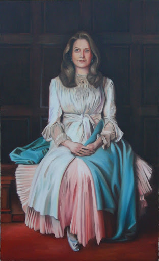
Today, I’m posting the photo from which I’m working. I changed my subject’s angle—compositionally, I like it better. Also, with the photo, I found myself cocking my head in order to get a better look at her.
She has a nose, once again, it will look even better once I can add a white glaze and highlights—which I tend to reserve for the final phase of the painting. The reason to hold off on white is that any color you add after that becomes milky, due to the heavy pigment—not good. Here’s something that you may or may not find interesting: The traditional watercolorist does not use white. They rely on areas left unpainted to serve as highlights, which is fine, however the whitest white one can achieve is only as light as the paper, which in most definitely not white.
Yes, it’s true, the nose has been scrubbed out. That’s because it didn’t look quite right to me, and by 'not quite right' I mean it looked 'short'—too much upper lip. So I measured it and I was a full 2mm off! Yikes—on a small painting (8"x 11"), that’s a lot.
Here’s where watercoloring gets tricky, and is unlike painting with oil or acrylic. You can’t just wipe out a mistake and start over (my husband will attest to this: he just finished a portrait of me [my head, on a John Singer Sargent] and I ended up looking like an orange on a toothpick! Okay, that’s an exaggeration—it wasn’t off by much, but we kept looking at it and felt as if something was ‘off.’ The solution? ‘Wipe’ it out and try again [which he did, and I’m all better, now])
Not so easy with watercolor. I can scrub or scrape depending on how much paint is down, and whether or not the color is ‘permanent.’ In this case, I scrubbed with a wet brush—it removes not only paint, but paper also, which is dicey. Then, I let it dry thoroughly, and as it’s doing so, scan it and post it for the world to see. Hopefully, I’ll be able to redeem myself; if not—well, that’s just the way it goes…and you get to watch…
...Stay tuned for the ‘nose rescue’ and the photo from which I’m working…
It's not as if I spent the day painting, but I thought I’d take a break from studio work and scan what I've done since yesterday. That way, I won't get ahead of myself.
I know all that grass looks like it will drive me nuts (and it might), but truth be told, I like painting grass...you'll see...
So much blue in the fair skin tone of this subject makes her particularly interesting to paint. Although there aren't a lot of contrasting shades to the color to her skin, there is still a lot of subtle build-up to the tone, necessary to give her skin depth and bring it to life. Otherwise, all that blue might look, well, not so lively…
…and wow, is that hair proving to be a challenge! Notice how I haven't even started on the grass yet.
The wash is the easiest part. It’s just a matter of laying down the lightest tone of each hue. It gives a little definition and a hint of what the color scheme will be. The biggest challenge here will be the hair and grass. If I were a less meticulous painter, I’d simply include just enough detail to suggest hair and grass; but I won’t be able to help myself when I see each blade and tress begging for its place on the paper.
The dress (an original, by the way) is the part I will most enjoy rendering: silk chiffon—one of my least preferred fabrics to sew (although it's way better than polyester), but, by far, my favorite to paint. The facings and narrow french seams actually become part of the design and the challenge.

 Well, I’m headed off to the hills—to the land of the technologically deprived and environmentally-imposed blogging hiatus—for a few weeks. Happily, I will have plenty of time to work on a new project or two…in a pretty little office…(see the little easle behind the desk and to the right of the window...)


